Lately I’ve been having some fun painting some lesser known Christmas special/movie characters and posting them on our Facebook page! Here are a few I’ve done so far…there are more coming next week, so make sure to like and follow us on Facebook for more fun inspiration to come!
“Pink Nighmare!” from A Christmas Story – painted on myself“Charlie-in-the-Box” from Rudolph the Red Nosed Reindeer – painted on myself! (Using some Ooh! Snowflake stencils!)“Hocus Pocus” from Frosty the Snowman – painted on myself! (Using some Ooh! Snowflake stencils!)“Abominable” (Buble!) – painted on my son Toby! (Using some Ooh! Snowflake stencils!)
Okay, this one below is not a particular movie character, however, it was an idea that came out of the Charlie-in-the-Box design with the pom poms! I thought they would make cute snowballs! 😀
Here are a few of the products I used for the snowflakes in many of these designs…I love the short kabuki brush for detailed stencil designs, and am totally in love with these Ooh! Snowflake stencils!!
It’s been one busy month here at Paintertainment with window painting! Besides the three Dunkin’ Donuts locations I have the pleasure of painting seasonally throughout the year, I also did an interior job, painting some conference rooms in an office building! So much fun…here are some photos and movies of what I’ve been up to so far this winter!
Dunkin’ Donuts…all set for winter!
This was the Chaska, MN Dunkin’ Donuts’ location…I did the top painting in the fall, and had designed it so that I could easily remove just the fall foliage, to update it for winter. Thankfully the lettering all looked just as pristine as the day I put it up, so it is able to hang on through another season!
Here is a time lapse video of the Chaska Dunkin’ location…this one is on two sides of the building…
Below is the Rogers, MN Dunkin’ location! This design was SO much fun! I love this client…she really lets me just have creative freedom and always chooses something super fun from my sketches. I love incorporating donuts into their designs! The previous fall design had a fun owl design on the lower panes, so we kept the text again here and I updated it for winter with some ice fishermen! This design definitely screams “Minnesota” as we love to ice fish here, and I was sure to paint a few of my favorite fish to catch here: sunfish, walleye and bass!
This window was the hardest physically for me to paint. It was supposed to be 50 degrees this day, however, it only ended up getting to 37 while I was painting. This is all fine of course if it’s sunny and not windy…I painted Chaska in 37 and sun and didn’t even need a coat. But, for whatever reason, this day I was absolutely freezing to the point of shaking! I think it was a combination of the cloudiness, the dampness (it had just rained the day before), and the breeze. So, the paint dried very slowly…but in the end I love how it turned out!!
Here is a video…
The third Dunkin’ location didn’t need much updating…I just removed some pumpkins and replaced them with snow!
With some careful planning, you can save a little time and money with seasonal updates! Of course, window paintings aren’t really meant to last more than a few weeks, but these ones stay relatively protected from weather, and still looked like new. So, why not make them last? I did turn her earmuffs from orange to red here as well. The other side of the building didn’t have anything super fall-ish so I left that one as-is.
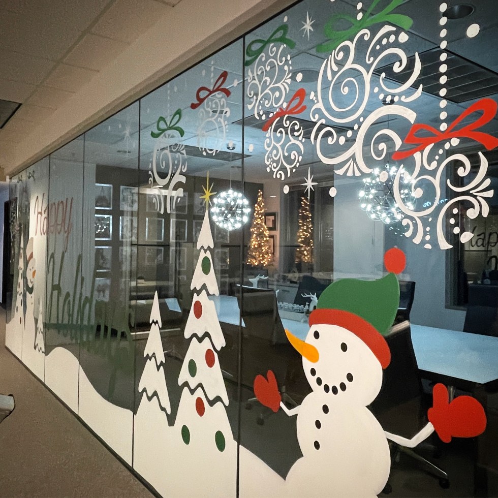
The last window job I’d like to share with you was my first INTERIOR job! This was for three conference rooms, which have basically a wall of glass.
This was a really fun and HUGE job! I probably painted around 50 feet lengthwise, and floor to ceiling. It was nerve wracking painting on carpet, but I made sure to have plenty of drop cloths and am super careful about making sure any paint I’m not using at the moment is closed up and in a safe spot. The tricky part here was keeping everything within just a few feet of the windows, so that people could still walk by me in the hallways!! It involved a lot of shuffling of my supplies. Also, being on the 7th floor, I probably spent 1/2 hour or so just bringing stuff in and out. I did also have to run out to Home Depot to grab a better, darker green…so all in all I spent about 10 hours straight here! Everything took more coats than usual…just because I am picky and I like it to be as opaque as possible. But, since these windows have exterior windows behind them, there is no way to completely avoid seeing brush strokes with the sun shining through them. I love how it turned out in the end, and it was really nice to be inside and not worry about weather! I also got to try out my new Posca paint pens for the ornaments. I didn’t take any time lapse movies of this, being that it was in an office, for privacy reasons.
So, as you can see I’ve been busy lately squeaking in window jobs between entertainment jobs! But, I really love window painting and I’m so glad that Covid pushed me to add this to my repertoire. It blends perfectly with my schedule, as I can paint windows on week days during the day, leaving those busy holiday weekends for face painting and balloon twisting!
Interested in learning more about becoming a window painter? Check out the latest issue of Wet Paint Magazine! I recently wrote an article about how I got into window painting, and the process I followed getting started, including some tips & tricks of the trade, resources to learn more, and a list of what supplies you need to get going!
Here’s a fun design that will last not just over the holidays, but the winter season as well!
1 – Using a round brush loaded with white, paint the shape of the Llama’s head, and a dot for the hat’s pom pom.
2 – Using a mini feather stencil HAS5086 (from the HAS Boho stencil set), create a forest of trees with different shades of green. I love using this stencil brush for this part!
Using a round brush, fill in the llama’s nose and ears with pink, and the hat/scarf with red.
Using a fine, round brush loaded with black, add some outlines and details. I’ve also added a touch of white as highlights on the nose and eyes. I love using Wolfe Black and Wolfe White for these.
Using your stencil brush loaded with white, add some snowflakes with your favorite snowflake stencil. Here I’m using an Ooh snowflake stencil!
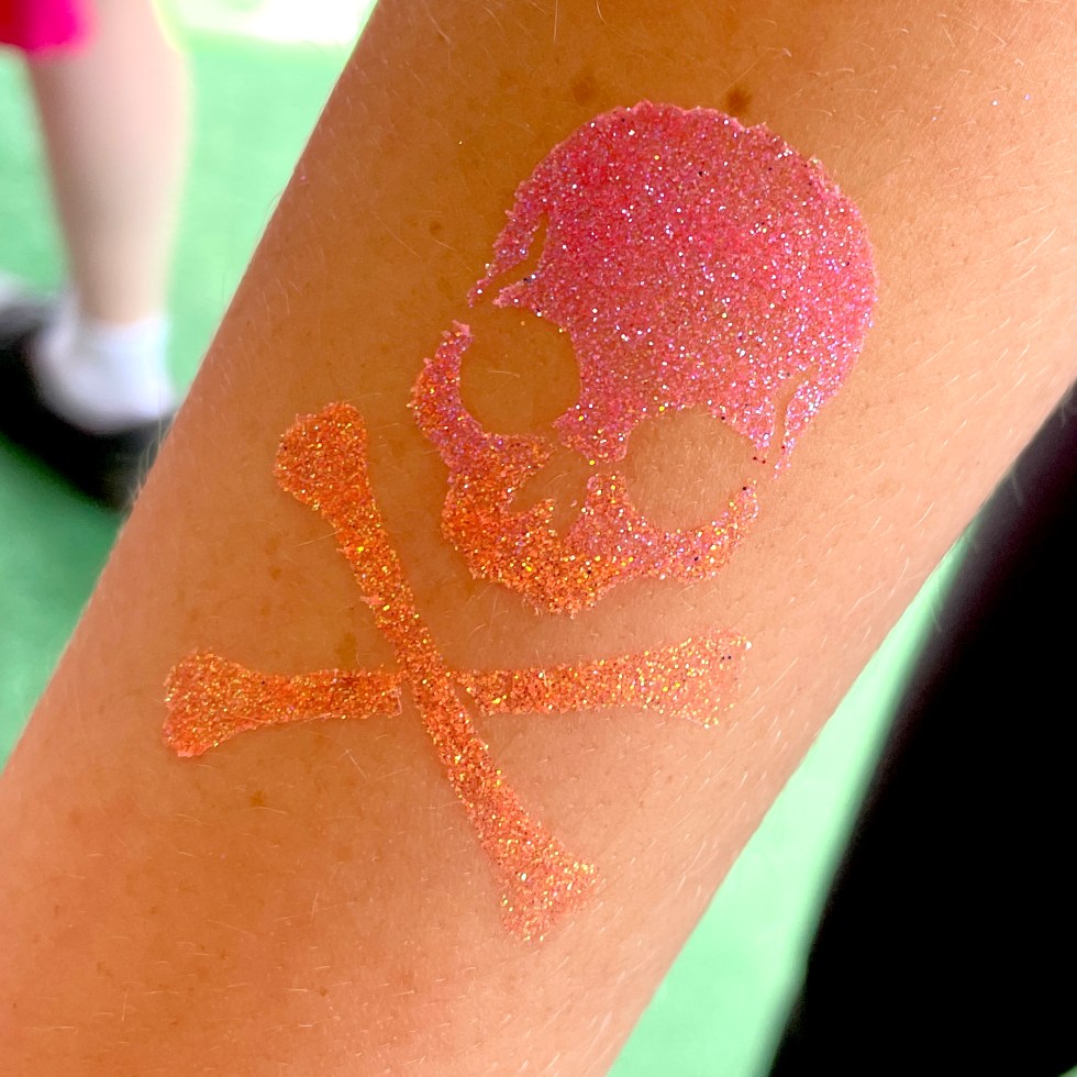
This past summer while working in my Glitter Glamper booth at the MN State Fair, I found myself not particularly loving my yellow, pink, and sometimes orange in glitter tattoos. The problem was that the kids saw my super bright looking “hot pink” glitter in my kit and always chose it, but it just didn’t come across as bright on the skin. I mean, you know how it goes…the kids still LOVE them, but we as artists are always our own worst critics, and we want our work to really pop. While it does depend a lot on the skin tone that they are being applied to, generally bright, bold and opaque colors just tend to show up better on glitter tattoos. Here are a few from the fair that showed my pink, yellow and orange woes…
I tried mixing in some orange with the yellow to capture the layering on Belle’s dress…meh…
This girl really wanted this pink and this orange…she loved it but to me it didn’t come across as bright as the jars of glitter may have led her to believe.
You can see how crisp and bold the dark green is…but as you get to the yellow flame tips, it starts to lose it’s readability a bit.
I found that I was not the only one in my booth having this struggle! But the awesome thing about working alongside so many painty friends is that you can learn from each other, share and test out other brands, and get better!
Well, now that the fair is over, I thought I would do a little experimenting with some different shades and brands of yellows, oranges and pinks…the three colors that seemed to disappoint me most! I should note, I am sharing this information simply to help my fellow artists. I don’t even sell most of these glitters in my shop yet…so it’s not a sales pitch and nobody paid me to do this. 😉 I tend to stock my whole store based on my own experiences and recommendations from painty friends, so I’ll likely be adding more of these down the road as I test them and fall in love with some!
Anyway, here are some photos of swatches on my own arm, along with some gif’s to show the sparkle factor!
Pink Glitters
I had the most shades of pink to test! The one I currently have in my kit is Amerikan Body Art’s Bubblegum Pink. It’s one that looks super bright, but when used as a glitter tattoo, isn’t quite so much. I do still LOVE this pink, and it is my go-to pink for face painting. It does tend to be a little bit more transparent which is why I think it doesn’t pop as much on plain skin. Over pink face paint though, it’s awesome and it’s sheer-ness means it won’t totally cover up my work but enhances it.
For glitter tattoos, however, I think the UV and Neon shades seemed to show the most contrast against the skin. So, if you’re going for that as your goal, I’d recommend the UV and Neon options. I’ve included some other shades of pink too, because you don’t always necessarily want the UV look, and there are applications for both. I also think that the non-neon versions do have more sparkle in the light!
Yellow Glitters
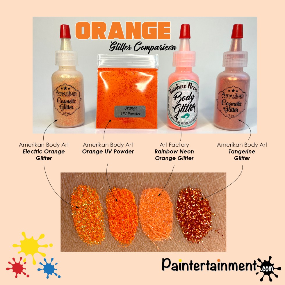
Same goes for the yellows, and the oranges below for that matter. The UV/Neon versions seem to be a lot more opaque and bold, though the more sheer, iridescent colors have more sparkle to them. I had been using Amerikan Body Art’s Lemon Zest…much like the bubblegum pink, I still think it’s the best for face painting, where the neon/uv versions are more bold and high contrast for glitter tattoos. The powders are less glittery, but I thought were worth a try in this comparison!
Orange Glitters
Electric Orange is my fave for face painting, again, though the UV/Neon options seem more opaque. I do like Amerikan Body Art’s Tangerine glitter too, for a darker orange!
Summary…
This is by NO MEANS an exhaustive sampling of these colors. I chose some from my existing vendors, some that looked good to me online, some that I found my fellow artists using, and some that I already had on hand. But what I’ve learned is that the more holographic glitters are best when poofed over face paint of a similar color, though the UV/Neon versions seem to be more bold and opaque when applied directly over bare skin, as we do for glitter tattoos. Neon glitters and powders are bolder, though the non-neon ones tend to have more sparkle.
Do with this information whatever you wish! For me, this has pretty much just made my kit grow, haha! I love both the more iridescent and the more opaque glitters and will keep both in my kit…just as I have both glycerine based and wax based blacks and whites in my face paint kit! They both have their ideal application.
Do you have a favorite shade of yellow, orange or pink that isn’t listed here? I’d LOVE to hear about it!!
Post it in the comments! I really prefer my blog posts to be living documents where we can all share ideas and new things as new things come along. We all know there’s a new product practically every week in our world, ha! Your comments help keep these posts relevant, so please feel free to share! Challenge my opinions and post your own! Thanks so much for stopping by and I hope this post has helped you in your own quest for the perfect glitter for your application!
This article was originally published in one of our free e-newsletters! If you’d like to be among the first to receive articles like this, along with free step-by-step designs and coupon codes for our store, you can click here to subscribe and to download past issues!
At the beginning of 2020 I started a habit of organizing my weeks and days that was really working well for me. Sadly, Covid eventually interrupted my momentum and my new routine fell by the wayside as I focused on the struggle to simply put on real pants and juggle a spouse and kids all working from home! These things happened to many of us, but when you’re your own boss, you eventually realize that nobody is going to hold you accountable for accomplishing anything except yourself. I have come to the realization that, even though I might not feel like my daily tasks and goals are as numerous or lofty as they were pre-covid, simply having them and laying out a plan plays a big role in my overall well being, my family’s well being, and my business’s well being! SO, as I look forward to our post-covid future, I’ve decided to go back to what was working before!
I’m going to share just this one piece of my organization and accountability process, in hopes that it might inspire you to create your own! Feel free to use my method, or twek it to make it more personal to you!
I use my phone and electronic reminders for everything, but I still like tactile things like paper. And stickers. And color coded tabs, markers and pencils! So I organize myself in an old school, 3-ring planner binder. But I start with an empty binder…not one with pre-made pages…so that I can truly make it MINE!
First I identified what things EVERY day needed. On top of every page I have a space for that day’s commitments, where I write in meetings, events, and other stuff going on that day. Then I have my “Do-NOW’s” which are tasks that are urgent and can’t wait for another day…such as packing up a customer’s online order, responding to quote requests, etc. On the bottom of every page I have personal tasks I want to remember to do every day. For me those are my devotions, and some sort of physical activity or workout. You can make these be anything you want! Time for yourself, time for rest, time to feed your own soul and body. I know I want to aim for exercise and devotions every day, so those are printed on every sheet, but I also have blank lines for non-daily personal tasks I want to do that day.
The Different, Changing-Daily Tasks
I have SO many to-do’s flying around my brain at any given time, but I know that the key to productivity is to FOCUS on single things at a time. For this reason I try to dedicate each day of the week to a particular “bucket.” When I think of a new to-do, I find whichever day of the week it fits best with, I add it to that day’s list of tasks, and then I can rest knowing it’ll get done that week. I like catchy alliteration, so I came up with some sort of theme for each day of the week. Here are my daily themes:
Media Monday
Mondays are my day to focus on my website, creating social media content, newsletters, etc.
Tackle it Tuesday
On Tuesdays I ask myself, what random tasks can I get crossed off my to-do list today? I start with quick, small things and work my way up so I can cross off a lot and feel accomplished. And yes, I’ve been known to write down things I already did just so I can mark down that super satisfying check mark, haha!
Weight Lift Wednesday
Wednesdays I focus on chipping away at a task that is heavily weighing on my mind that week. It can be a huge project, a personal thing, or just something I really don’t want to do but want to quit thinking about!
Think Big Thursday
Thursdays I dedicate to big ideas and future goals and large projects. These might change from week to week, but I always have something that fits! The back of my planner has divider tabs dedicated to my big projects.
Financial Friday
Last year Fridays were “frazzled Fridays” where I tied up random loose ends. This year I decided I need to be more regular about keeping up with boring financial stuff (because I hated the pile of work that awaited me come tax season!), so Fridays my goal is to catch up on filing receipts, reconciling bank accounts, and checking in on the status of invoices. Which brings up a good point about all this…if you are going through your week or month or year and discover that a particular theme day doesn’t seem to be working for you, or like me, you find that there’s something you’re not getting done that you’d benefit from fitting into your regular routine, change it up! I designed these planner sheets on my computer so I can change them up easily. I also don’t print out an entire year at once…I print out maybe a couple months out, just in case I want to make a change.
Say-NO Saturday
What you DON’T put on your calendar is just as important, if not more important, than what you do! On Saturday I write down the things I said no to that week which would have drained me, and write down what else I was able to do with that time that filled me up instead! Don’t feel bad about what you turn down…celebrate what saying “no” gave back to you!
Start Again Sunday
Sunday is my day to reflect, restore and re-focus. I reflect on the past week, take time to rest, and look ahead at next week’s plan.
My Other Binder Accessories…
There are a few other little things I have in my binder to help organize things…
While I don’t print out daily pages for an entire year up front, I do still want to have a place to jot down gigs, conventions, and other events that are farther out into the future, and be able to see a month at a glance. So, I got these blank monthly planner refills. I put each month’s spread right into my daily pages, so they work as dividers for my daily pages as well.
I like to be able to quickly flip to TODAY in my planner, so I also purchased a pack of these little snap-in bookmarks. I labeled one “TODAY,” and each day I move it farther into my planner to mark the day I’m on.
I purchased these little pockets that are great for stuffing small bits of mail, to-do lists, receipts, etc that I want to put with a project or month or day, but don’t want to hole punch.
“But I don’t think like this!”
Many of you are probably thinking, “But I’m an artist! I don’t think like this…I live in an organized chaos and bounce around from task to task. I could never live this organized!” But I’ll tell you, I’m the same way! I can get SO easily distracted by shiny things (literally and figuratively), and am always bouncing from thing to thing. I love crossing things off my list, but after a while, that bouncing can get mentally exhausting. One minute I’m working on one thing, and the next I am distracted by a new idea, or I remember something else I need to do that day/week. Having this method to my madness has removed a lot of the madness from my methods!! Now when I’m working away and an idea or task comes to mind, I don’t have to worry about forgetting it or it not getting done. I simply stop, and think about the urgency first. Did an order just come in and it needs to ship asap? Then I write it down on my “Do-Now’s” for the day. Can it wait a few days? Then I figure out which theme day it fits within best, and write it on THAT day’s “Do-Now’s.” Is it a new appointment or a family activity to schedule? I write it down under the commitments on whatever day’s page it is. The act of writing these things down gets them OUT of my head, so that I can cut off the distraction without losing the task, and more quickly get back to what I was focusing on that day.
Of course life happens, and many days the “theme” gets overridden by an event or something else more urgent. And that is totally fine! Remember, these theme days are just a guideline to help you get things done by focusing more each day on a particular task or bucket. You’ll always have “do-now’s” that jump in at a moment’s notice, and you’ll always have big ideas that you’d like to remember to work on someday. But I find that sorting my days by theme helps me to focus on one thing without fear of the others getting forgotten, and in turn, be more productive. In general I try to at least get all of my “Do-Now’s” done every day (the things that truly can’t wait), and the day’s commitments. Everything else I count as extra productivity. If I have to spend half the day running errands and don’t get to one task I had written down for one day, if it’s urgent I’ll move it to the next day’s “do-now’s,” but if it’s not super urgent, I’ll move it to that same theme day next week! Give yourself some grace and flexibility in the process!
I hope that you are able to find some method to the madness in 2021 that works for you!


 W07 Ooh! Snowflake Wrap$5.00
 W08 Ooh! Snowflake Wrap$5.00
 Short Kabuki Stencil Brush$4.99








You must be logged in to post a comment.